Imagine that you are designing a mobile app that lets users add a profile picture via their phone's camera. How would you go about preventing users from uploading pictures of their 'naughty bits' as their profile pic?
One option might be to do advanced image analysis on the picture once it has been taken. This could potentially be a very good way to weed out images based on their similarity to forbidden images. Unfortunately, this adds complexity to the system since the image analysis algorithm needs to be developed internally or selected from off-the-shelf components. In addition, this design implies that the user's profile pic probably can't be added immediately to their profile. No matter how fast the image analysis algorithm is, the feature will never really feel quick.
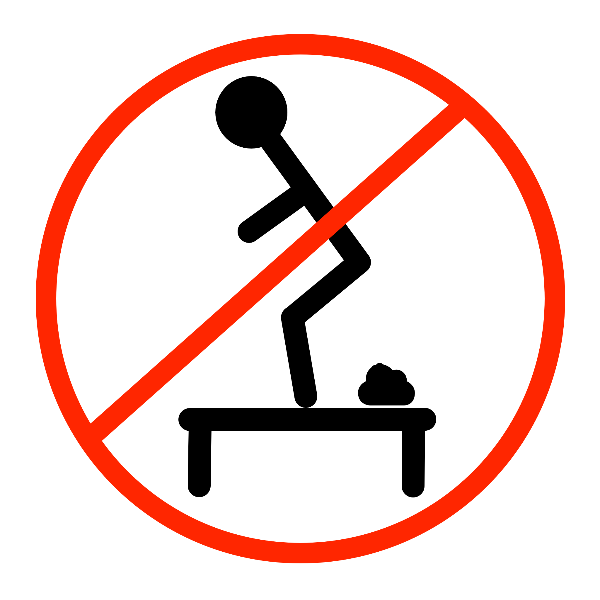
Let's say you decide not to go the sophisticated route. Another option might be to put a warning on the screen before the camera is displayed to the user. That's a very inexpensive option since you only need a warning dialog prompt or perhaps just warning text on the screen. Unfortunately, you never want to be in a position of telling users to "Please don't poop on the tables" if you can avoid doing so. While trying to catch the small percentage of users that were going to do the wrong thing, you end up admonishing the majority of users that were going to do the right thing.
The best solution is simple: display the front-facing camera by default. The user is most likely interacting with your app in a way where their face would naturally be aligned with the front-facing camera. The path with the least amount of friction is the path we want the user to take. The user simply launches the camera and snaps a photo. No muss, no fuss.
This simple user interface design choice helps to reinforce the idea to the user that they should take a photo of their face and not their naughty bits. In fact, it would take more effort to switch to the rear-facing camera than it would be to simply tap the shutter button.
Folks, sometimes users just need a gentle push in the right direction. Trust that your guidance will lead to the desired result.